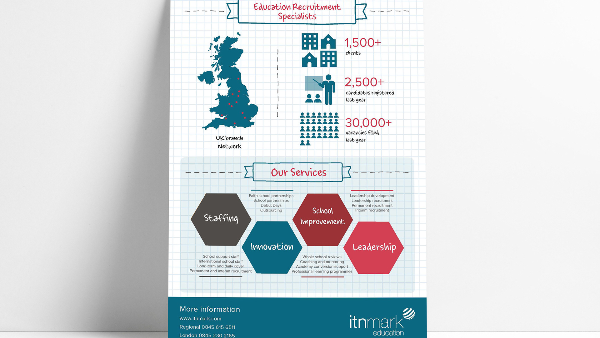
This is the brand identity I created for a business consultancy who specialised in the construction sector. The shapes piecing together graphic represents how this consultancy helps 'piece' together complex ideas - and also offers 4 key areas of support. They are also 'building blocks' creating one larger arrowhead shape. The arrowhead shape represents how this consultancy helps businesses to move forward in their goals and objectives.
It was important that the 4 key areas of support were defined so that they could have their own sub-identities.
